Magazine Cover
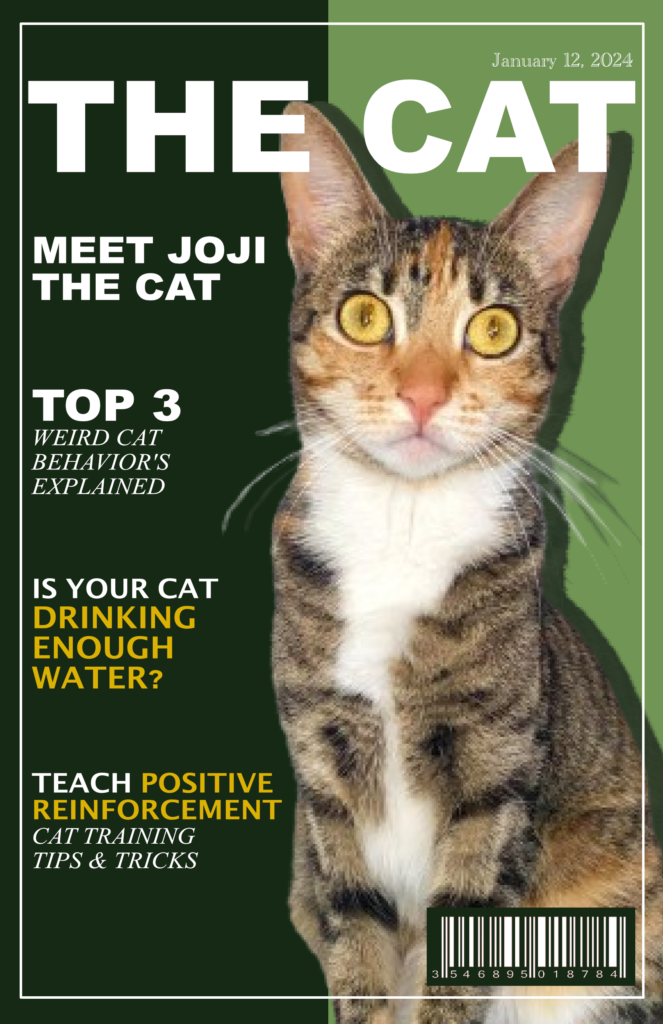
This fun and monochromatic magazine cover was created with the principles of design in mind.
Tools:
- Affinity Photo
Design Principles:
- Hierarchy, Contrast, & Balance
Process:
- I used hierarchy to organize the elements based on importance. For instance, the magazine cover name is the biggest font, and the section of lower importance is smaller. I have also used different colored fonts to create contrast and emphasize important content.
- The white and yellow fonts contrast with the dark background to make the content easier to read.
- The magazine cover does an amazing job of balancing content, as the text is placed to the left and the image is on the right.

User Manual
Get to know me a bit more with this user manual!
Tools:
- Affinity Photo
Design Principles:
- Balance, Monochrome, & Continuity
Process:
- With this design, I focused heavily on the layout. I created a sense of balance by creating a split. On the left side, I added a box with content and a heading above it. On the right, I placed a full-length photo to create balance.
- I wanted to create a monochromatic piece with my favorite color. I love all shades of green, but I wanted to keep it simple to prevent the user from getting distracted. I also utilized the different tones of green to create contrast between the dark green square and the white font.
- The photo provides a sense of continuity through the positioning of myself in the photo. I am facing towards the left, which causes the reader to shift their eyes to the left to learn more about me.
Valentine’s Day Card
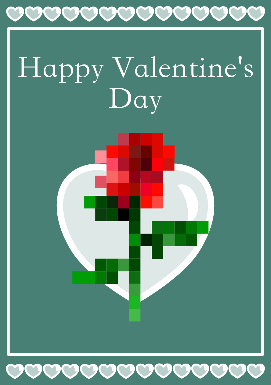
As an avid Minecraft player, I don’t see many holiday cards inspired by the game. Minecraft is a block game where players can go on adventures. With this in mind, I created a Valentine’s Day card inspired by the blocks and items in the game.
Tools:
- Affinity Photo
Design Principles:
- Typography, Color, & Contrast
Process:
- I wanted to recreate my rendition of the rose on Minecraft. To achieve this, I used 65 squares to create the flower using shades of red, pink, and green.
- I chose a darker sea moss green color for the background because it compliments the shades of red on the rose and makes the white heart in the foreground stand out.
- I chose the font STKaiti because it is simplistic enough to complement the minimalistic design but is elegant and completes the design.

Sticker Illustration
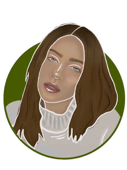
I designed an illustration of the famous singer, Billie Eilish, as an effort to explore different illustration techniques on Procreate.
Tools:
- Procreate
Design Principles:
- Linework, Emphasis, & Contrast
Process:
- This image is a still shot from her music video for Xanny.
- I started by sketching the reference image to get the proportions of my illustration correct.
- Then I picked my color palette and chose colors that complement each other. The reference has a sad and eerie tone, which led me to use these darker, muted colors.
- I emphasized her facial features by adding white highlights. This helped create contrast and recover the details that were lost due to the muted tones.
