
The first website that I am critiquing is amazon.com
How is the website using graphic design concepts?
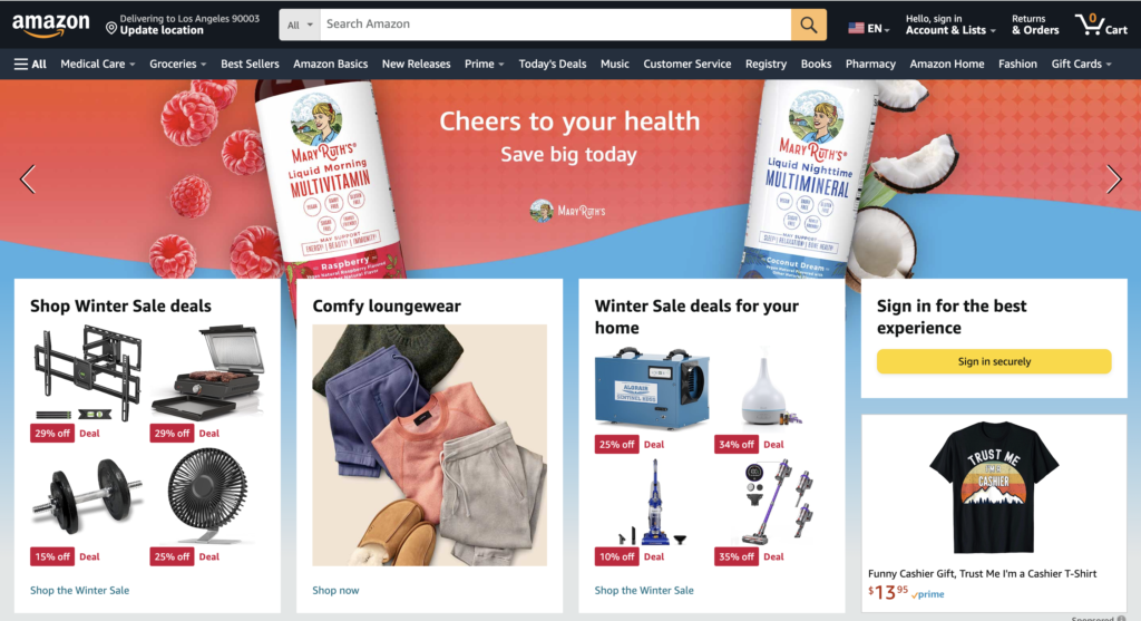
- Amazon is using similarity by placing all of its categories in multiple boxes across the page. Since the boxes are the same size and color it makes the user recognize that they are used to separate each category within a singular box.
- Amazon uses continuity by placing its content in a row of uniform lines across the webpage. This ensures that the user’s eyes move up and down the page.
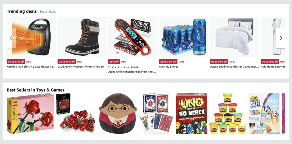
- Closure is seen on the second screenshot where half of a product’s picture is cut off, but the user can infer that by scrolling to the right more products are available.
- Amazon is using proximity by placing the sub-sections of the winter deals within a box. This makes the user recognize that they are grouped and belong in the same category because they all have the big red discount tags, and therefore must be on sale.
- Amazon uses figure/ground by strategically placing a darker background, which makes the content in the foreground of the page stand out so the user is drawn to it.
- The row of boxes that are displayed across the Amazon website adds symmetry/order to the webpage. This creates organization and makes the content on the page easier to find.
- In the second screenshot, there is an option to scroll through both best sellers categories. It appears that there are more products to the right of the screen because half of the picture is cut off. This is known as common fate because the user can assume that all of the products on that row that are moving towards the right are related.
Describe how you feel about the design overall, then break it down and describe how the individual elements make you feel.
The overall design of this website feels very cluttered, but it is organized in a way that makes it less overwhelming for the user. I like how everything is labeled and organized in its own box. There are multiple rows of organized boxes, and a longer solid rectangle breaks up the pattern and fills the entire row. This rectangle displays larger products, which I think is intentional as it is labeled as ‘best sellers’. This is a great organizational strategy because it pushes products that Amazon thinks the user might like to the foreground.
Do you feel the design is effectively communicating the intended message? How so?
The point of Amazon is to sell its products to its consumers. The design of the website effectively communicates its intended message as it easily categorizes its products to fit the needs of the consumer. For instance, when looking at the homepage you can see that Amazon has winter essentials displayed at the top of the page. This reaches a large audience because winter is a season that affects everyone. If there is a product that a consumer cannot find there is also a search bar in the top center of the page. This is important because it makes searching for a product easier to find. Below the search bar, there is a navigation tab, which displays a large selection of categories from grocery shopping to audiobooks.
Do you like this design? Why or why not? If not, what do you think could be changed to improve it? If you do like it, can you think of anything that might elevate the design?
I enjoy the design of Amazon’s website because it is easy to navigate. Anytime I need to find a product it is either under a category on the homepage or easily accessible with a search. I am also someone who enjoys shopping and finding the best possible deals. This is easily done on Amazon, as there is a ‘Todays Deals’ tab at the top of the homepage. If I scroll down the page there is also a variety of trending deals that might be popular because they are highly rated, or talked about on social media.
To elevate Amazon’s design, I would add simplicity to the way they present the perks that come with Amazon Prime. As someone who has this service there are a ton of features that I didn’t know about. For instance, the other day I found out that if you have snap benefits you are eligible for prime at a discounted price. I think as a consumer this is very important to know. In order to implement this into their design I would have a separate tab in the navigation bar that takes me to a list with all of their resources for a smoother experience.


The second website I am critiquing is store.steampowered.com
How is the website using graphic design concepts?
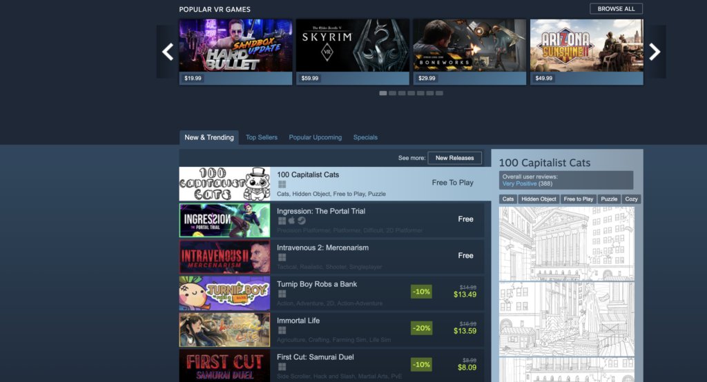
- Steam is using similarity by placing all the ‘New & Trending’ games in a dark blue rectangle. Since all of the content is placed in the same colored rectangle, we can infer that the content will be similar.
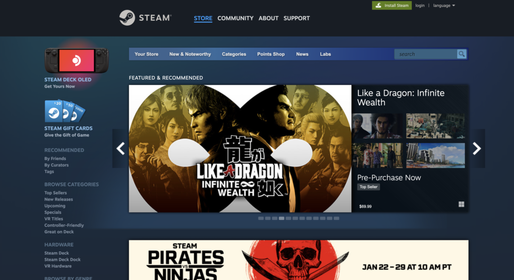
- Even though the content on the website is off-centered, it follows continuity as it follows the same path from the top to the bottom of the page.
- On the right-hand side of the screen, as seen in the screenshot above, a light blue rectangle connects to the game that is selected. This shows closure because the user can infer that the images in that section correlate to the game selected.
- Steam uses proximity by using a lot of negative space between each section. The elements that are close together within a section are grouped because of proximity.
- Although a lot of the colors on this page are darker, Steam uses figure/ground by grouping elements using the same colors. The background color is darker, which creates this contrast.
- The sections on Steam are organized in rows, which create symmetry/order.
- Steam uses an arrow to organize games by category, and because all objects are moving in the same direction, it is known as common fate.
Describe how you feel about the design overall, then break it down and describe how the individual elements make you feel.
The design is very plain, but it is effective. I like how the top of the page is used to announce important information. For instance, they are currently advertising their ‘Capitalism and Economy Fest’, which is a points system based on games that you buy within specific dates. When you scroll down the homepage, you are met with different sections. These sections are properly labeled and easy to navigate. My favorite part about this website is towards the bottom, where it is labeled ‘New & Trending’. When you click on a game, the right-hand side of the screen shows the user any information about the game, including the genre, ratings, and images from the game. This is my favorite part because the user can quickly see this information without leaving the page.
Do you feel the design is effectively communicating the intended message? How so?
The Steam Shop is an online platform where users can purchase video games for their PCs. When I look at the website, it is obvious that it is an online store because they have multiple games for sale. I think the design is effective because it displays a large variety of games that reach a large audience. For instance, the top of the page contains a huge ‘featured and recommended’ section, which advertises popular games. They also have a game streaming section where the user can check out livestreams of a game they are planning on purchasing.
Do you like this design? Why or why not? If not, what do you think could be changed to improve it? If you do like it, can you think of anything that might elevate the design?
I like the design of this website because it is simple and the content doesn’t feel crowded. However, I do think some things can be changed to maximize the user experience. The login button is very small and gets overlooked because it is placed right next to a big green download button. I also think the navigation tab should be at the top, not on the left-hand side of the page because once it ends there is a lot of negative space. This space makes the rest of the content on the page look off-centered, which throws off the alignment. Halfway through the page the background color abruptly changes from dark blue to light blue, as seen in the screenshot above. At first, I thought it was intentional because it highlighted the games on discount, but there is a huge discount section near the top of the page. Overall, there is room for improvement, but the simplicity of the website makes the content easier to find.